Case Study
Leading Product Design for SnapCheck, I recognized the need to create a unified style guide to address potential design traps across all our products and marketing materials.
The focus included common pitfalls and oversights made by the engineers, developers, and quality assurance testers.
I built the style guide in four different formats to in order to be able to address distribution needs and each format to serve different purposes.
The first version was a 4-page reference guide to provide direction for commonly asked questions.
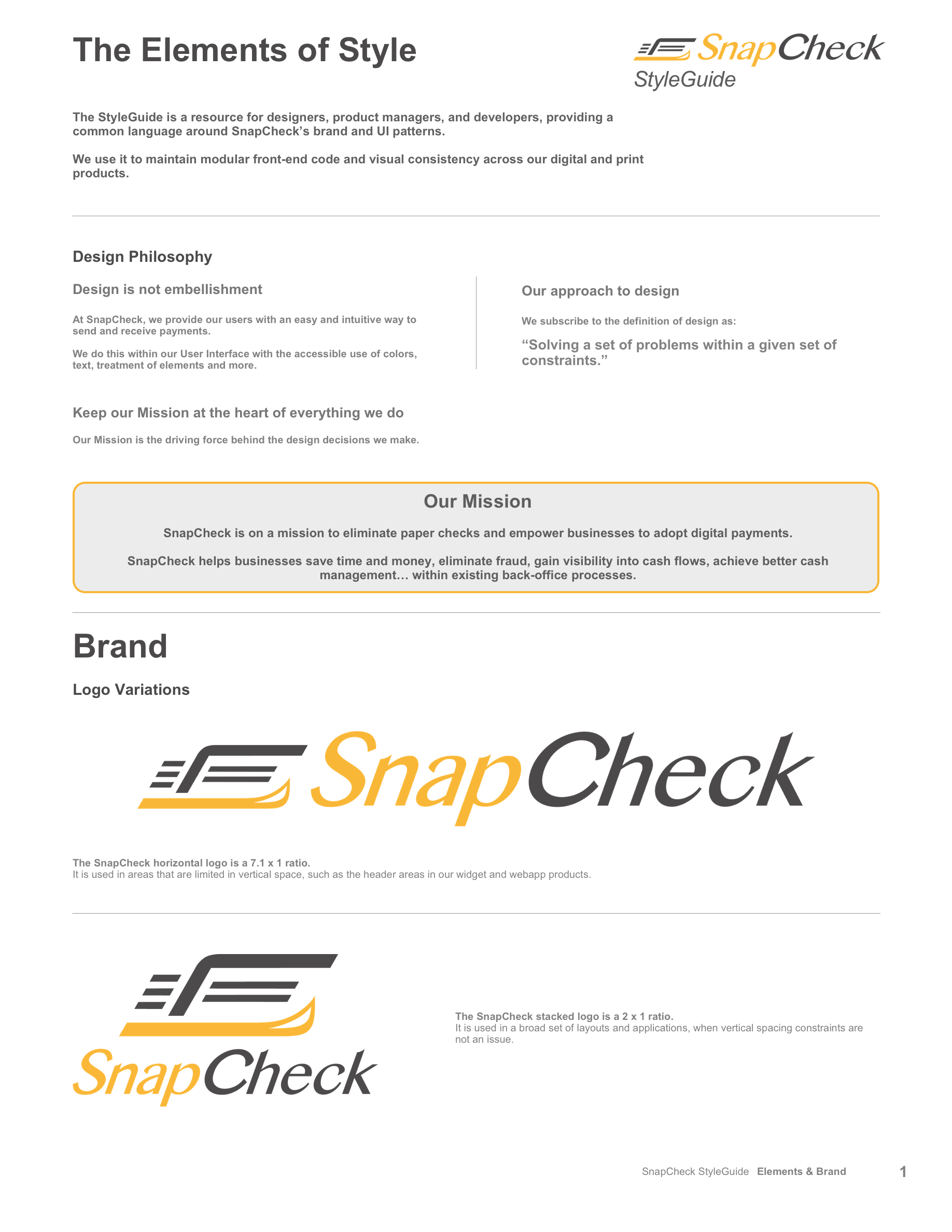
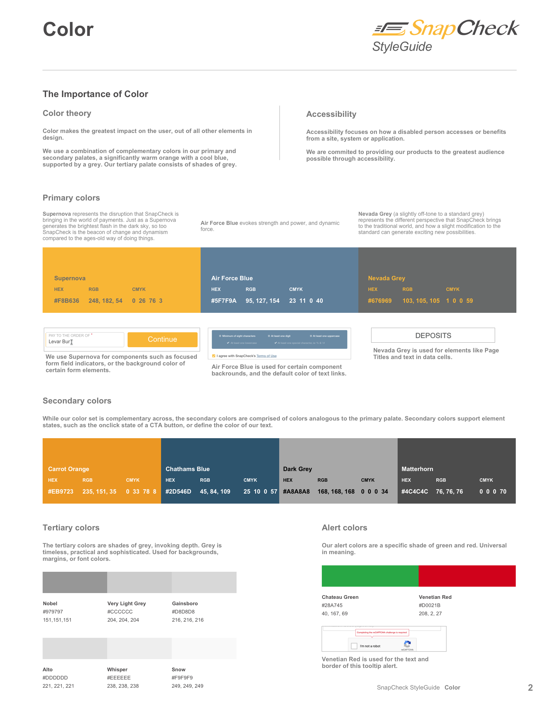
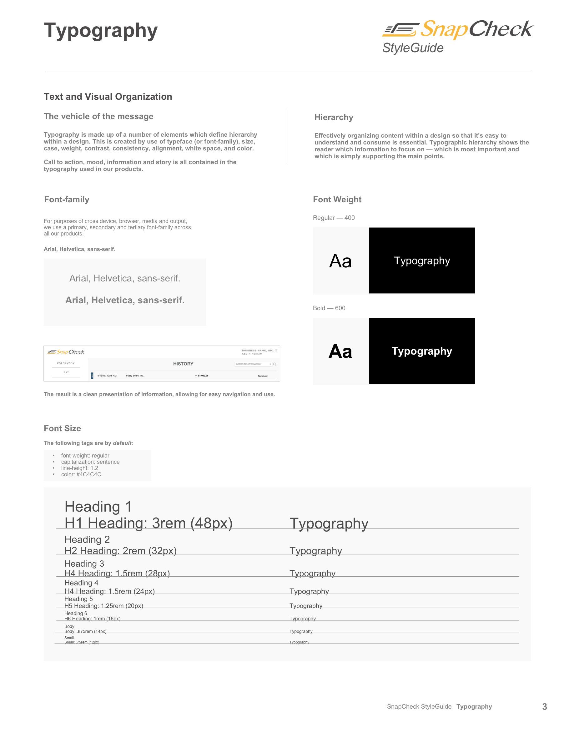
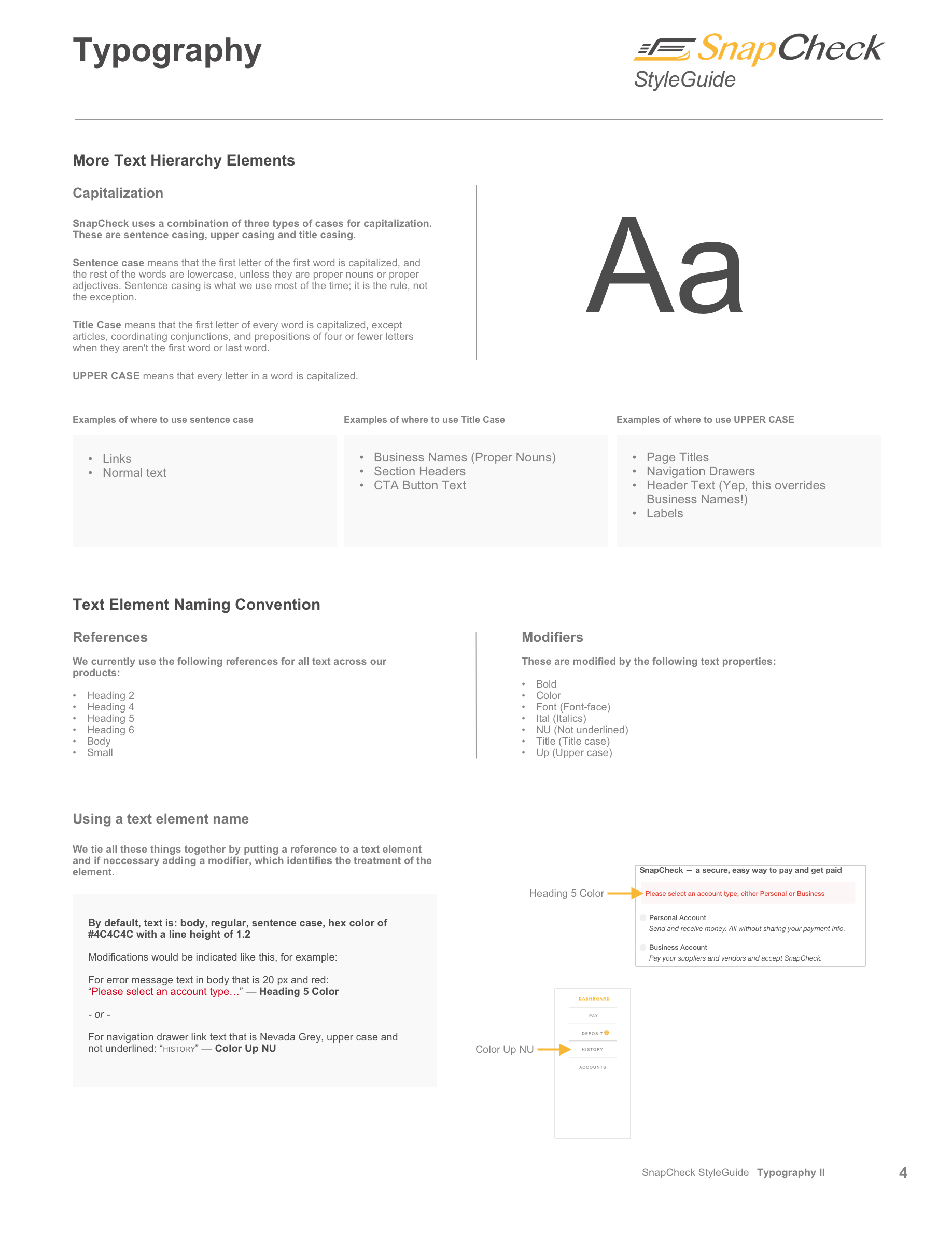
The second version was designed in Google Slides. It is for presentation across departments and design guidance across the widest span of channels.
In the Google Slide format, the style guide is broken down into three parts.
1. An overview for all stakeholders which summarizes everything in the design approach.
2. An introduction to the elements of a style guide and how it is used.
3. A deep dive into all parts of the design, development, and testing process.
The second version, created in order for the dev and QA teams to reference, is the live style guide itself. Created in Sketch and published in Zeplin, it can be viewed here:
Finally the third version is the actual CSS file used by the developers of our public-facing website and our online product, which I coded by hand and built using the Angular web application framework:
