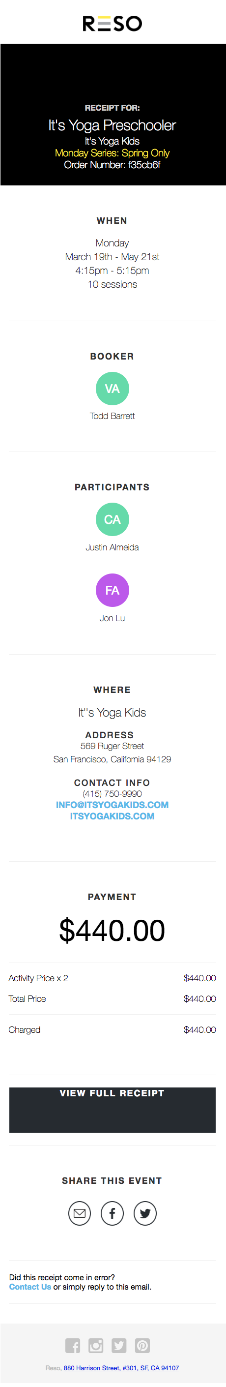
Case Study
When I interviewed for a design position at Reso.ai, they asked me to look at the email template they used to send the customer a receipt of their reservation. I pointed out that the format was too long, and contained information that the user did not need to see in the email.
I created a prototype onsite that focuses on the information that the recipient will prioritize, and shortens the vertical length email.
Below on the left is a screenshot of the original email, and on the right, my proposed prototype.

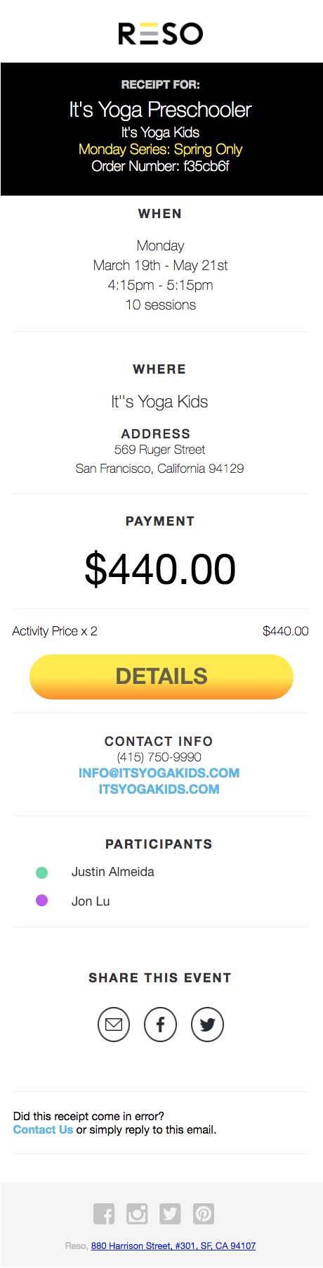
Again, their original and my mockup, side by side