As the final project in my General Assembly 10-Week Immersive in User Experience Design, I worked with an existing startup to identify a major pain point and propose a design direction to resolve it.
Their response: "We worked with Todd as part of his General Assembly UX Design course. His team project focused on our most difficult design challenges, and his solution was both well thought-out and actionable. He was a pleasure to work with, and accomplished a good deal in a short window." Alex Scott, VP of Product
About the client Revere.ai provides a platform that engages in real-time monitoring of marketing apps. Revere monitors events and performance for business data, giving real insights into business apps and delivering them as they happen.


The Challenge
Depending on the number of accounts that are linked and alerts that are set, some users experience an overwhelming number of reports in Slack. How can we minimize this while still delivering value? Do users need a simple way to snooze certain alerts? Is there a threshold of acceptable alerts?
Objectives
○ Equip Revere.ai with better insight of their current user pain points
○ Understand why users are receiving too many alerts
○ Provide suggestions of how Revere.ai can improve user experience
○ Equip Revere.ai with better insight of their current user pain points
○ Understand why users are receiving too many alerts
○ Provide suggestions of how Revere.ai can improve user experience
The following steps in the design process were implemented:
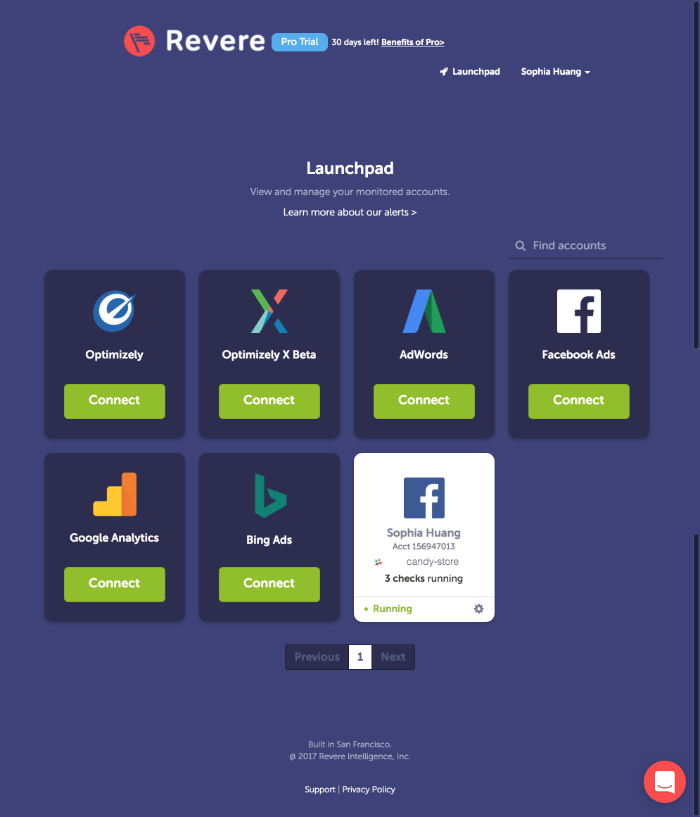
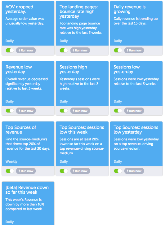
The first step in understanding the need for Revere was to go through their signup and onboarding process, and set up the alerts. After gaining familiarity, we completed a competitive analysis.
Creating logical flows (my favorite part) for the existing user onboarding...
(The onboarding flow is a little small, so let me magnify that a bit)
And also the flows for Settings and Slack alerts... gave us the insights we were looking for.
And from these we were able to create the following:
Problem Statement
The onboarding process does not require users to choose which alerts they will receive. The default state is to receive all available alerts and then turn off the ones that are irrelevant.
Adding channels in Slack can help funnel delivery but redirecting marketing accounts one at a time is time consuming.
There is no feedback system in place for alerts.
Hypothesis
We believe that the solution is three-fold based on each of the user flows that we examined — onboarding, settings, and alerts.
1. I set the alerts that I want when connecting my marketing account.
2. I compile my accounts into teams so I can control alert frequency more easily.
3. I provide feedback that helps manage my alert settings based on usefulness.
We did not have access to users to interview until late in the game, but the power user that we were provided with confirmed what we were coming to understand, and the solutions that we were coming up with.
In his own words: "The sheer volume of messages is too much to digest” and "Multiple Slack channels helps me control the amount of alerts I receive.”
These solutions are outlined in the updated logical flow.
These solutions are outlined in the updated logical flow.
Proposed Onboarding with the user able now to control what alerts they receive in Slack from the get go, instead of the "firehose" of data approach. It also made the most sense for the user to create teams at this stage.
(A little bigger)
Proposed Settings...
And proposed Slack alerts with the ability to provide feedback on the usefulness of the notifications. I will cover this in more detail later.
Using the logical flows for guidance the whiteboard was brought in for some lo-fi wireframes.
Onboarding
Settings
Slack Alert
High fidelity wireframes were created to show the proposed flow. Here is the Slack Alert proposal:
Taking our prototype to user testing resulted in a SUS of 85% and NPS of 50% and helpful feedback.
We were left with the following insights which were implemented as part of the iterative process:
On-boarding:
○ Launchpad was spaced out; information fell below the fold
Account Settings
○ Ability to edit and add teams in “Account Settings” was not intuitive for users
○ Team “edit” and “add new team” buttons on launchpad appeared to be the quickest way for users to edit and add new teams.
Alerts in Slack
○ After feedback was provided, confirmation message and option to undo should appear in Slack
○ “Why am I seeing this?” should route to a specific alert information page, instead of a generalized “Alerts Delivery” page
Conclusion
This was all we had time to complete in our two weeks. We wrapped up the project with our design recommendation and proposed the following next steps....
○ Interview more current users
○ Further user testing
○ Detailed “About” pages for each alert
○ Greater visual distinction for each alert in Slack